2NFORM has a new look!
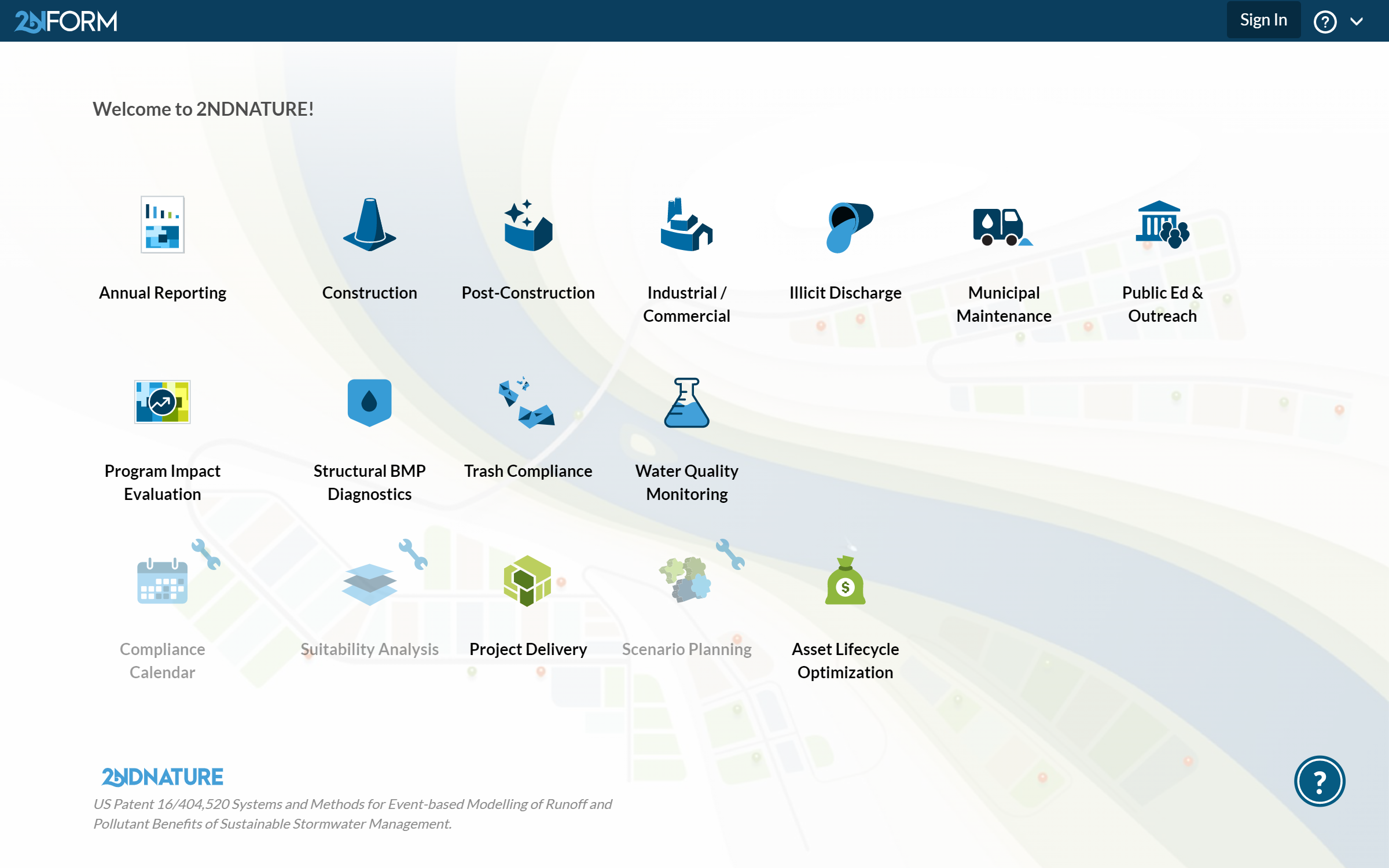
2NDNATURE has launched a new look for 2NFORM’s home page. Based on feedback from you, we created a design that is simple, configured, and mobile-friendly.
SIMPLE – We have reduced the text on the page and updated the icons. With less visual clutter, you can find the module you need quickly. We have also added direct access to the Help Center, making it much easier to find the answers you need.

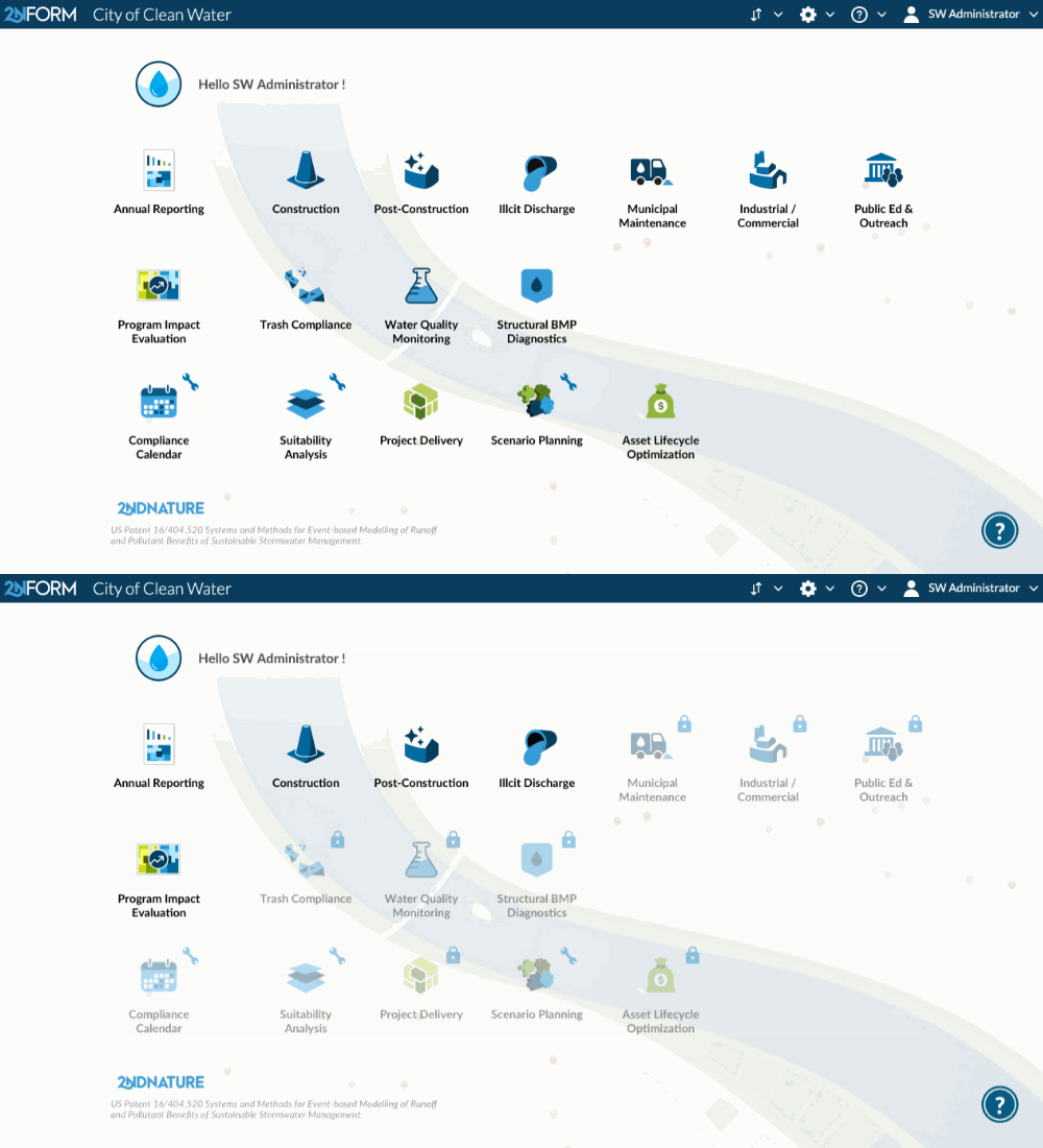
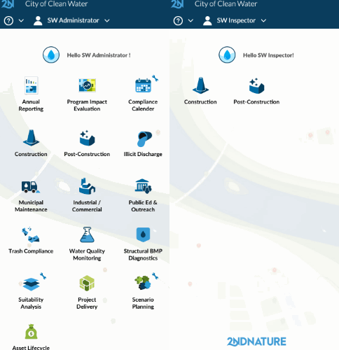
CONFIGURED – Your new home page shows only the modules that you can access. No more clicking to figure out where to go. Construction field inspectors will see only the Construction Module. Municipal maintenance staff will see only the Municipal Maintenance Module. You’ll have confidence that your staff can focus on their tasks and that your data is being managed correctly. Administrator users can configure these permissions when new users are created. You can add your organization’s logo to the home page, so your staff will always know they are in the right place.

Also for administrators, the home page now clearly communicates the modules available in your subscription. No more guessing which modules are included. You can also easily get more information on the other modules available with an upgrade.

MOBILE-FRIENDLY – The mobile friendly design ensures the best experience for your field staff. Created with field personnel in mind, the large icons allow for easy navigation between modules. And it works both online and offline, making sure work is not interrupted even when cell service is.

We are excited for the new look. We believe it addresses many of the usability concerns we have heard from you. As always, let us know what you think at https://2nform.com/feedback.html!


